Macs with 16GB RAM are becoming more common. That means the average user doesn’t need to quit applications that often anymore, causing the OS X Dock to get cluttered with icons of rarely used apps.
The OS X Dock was introduced in NeXTSTEP and was part of the first beta of OS X 10.0. It was meant to be a way to launch and keep track of active applications. Every time you launch an application, the corresponding icon is added at the end of the Dock, extending its length.
Today the Dock is used as:
- Application launcher
- Notification area through badges
- App switcher
- An area to park both minimized icons and file/folder shortcuts
Increasingly the Dock suffers from information overload, making it less usable than ever. Apple is likely aware of this fact, as in recent years it has laid out the groundwork for alternative ways to interact with applications without having the need to use it.
Maybe it’s time for Apple to kill the OS X Dock and move on.
The Dock
I came up with this rather radical idea because:
- The Dock takes space on the screen
- It doesn’t help much with conveying information
- The information the Dock can show is limited
- There are already other more efficient methods to launch, notify and switch between applications.
The tiny dots displayed under the application icons to indicate whether an app is running are becoming less useful as the speed and memory of our Macs increase. Nowadays, Mac users just leave their application running. System resources in our Macs are so plentiful and technologies like Power Nap so advanced, that the average user doesn’t really need to see at a glance if a certain app is running or not. And as I said there are alternative ways to get that info.
The badges displayed in the upper-right corner of Dock’s icons have limited use too. In my experience the only one I look at all is Mail. All the others, such as Twitter, RSS feeds and so on just add clutter and reduce attention span.
Application Launcher
The current primary function of the Dock is to launch applications, but we already have other ways to do so:
- Launchpad
- Spotlight
You could argue that you can also launch an application from the Finder. But the Finder itself will increasingly become less used, reserved to power users anyway, so let’s not take it into account in this discussion.
Launchpad

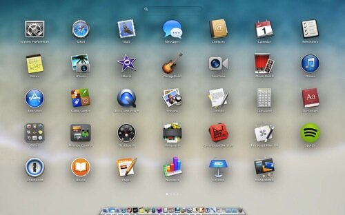
Launchpad is actually a gem of a launcher after you get familiar with it. Pinch the trackpad with the thumb and three fingers and you can see all apps installed on your Mac. In case you don’t find the app icon you want to launch, you can:
- Swipe with two fingers between screens until you find it
- Start typing its name to invoke instant search
Try it if you haven’t. Working with Launchpad is fast and user friendly.
Spotlight
Power users have used Spotlight to launch apps for years. In OS X Yosemite it will become even more prominent given its presence at the centre of the screen.
A simple command + space gives you the ability to launch applications, faster than ever and without moving your fingers from the keyboard.
Notifications
Apple has been improving Notification Center since its introduction with Mountain Lion in 2012. In OS X Yosemite, Notification Center is an area of the screen that users will visit more often than ever. The fact that we will be able to customize it by adding extensions can only increase its usefulness.
In my opinion, that is the only place where we should be able to see notifications.
App switcher
In iOS, you can switch between apps by double-clicking the home button. In contrast, OS X gives you two other options beside the Dock:
- Mission Control
- Command + tab
Mission Control is a powerful way to switch between desktops and windows belonging to single apps, but it’s not that immediate to see the window you want to switch to (contrary to Exposé. Read about my first reaction in OS X Lion ).

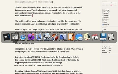
That is one of the reasons, power users have also used command + tab to fast-switch between open apps. The big advantage of command + tab is that its graphical representation is easy to understand because you see just a list of app icons in the middle of the screen.
The problem with it is that its key combination is not known by the average user. To make it more usable, Apple could assign a trackpad fingers swipe combination.
I’m thinking of a four finger swipe up. This is not a new idea, as on the iPad you can already invoke the app switcher by swiping your fingers with the same movement.
Conclusions
Apple doesn’t need to kill the Dock immediately, but OS X is mature enough to start looking for alternatives.
This process should be spread over time, in order to educate users on the new way of doing things. That could probably take two to three OS X iterations:
- In the first iteration (OS X 10.11) Apple could make the Dock invisible by default
- In a second iteration (OS X 10.12) Apple could disable the Dock by default (as it’s happening to the Dashboard in OS X Yosemite by the way)
- In the third iteration (OS X 10.13) it could ditch it altogether.
Operating systems change. What’s most important is that they change to improve their usability and make users more efficient. The Dock right now is having problems in both fronts.